Credits
- Can Printing —
Avery Dennison
- Photography —
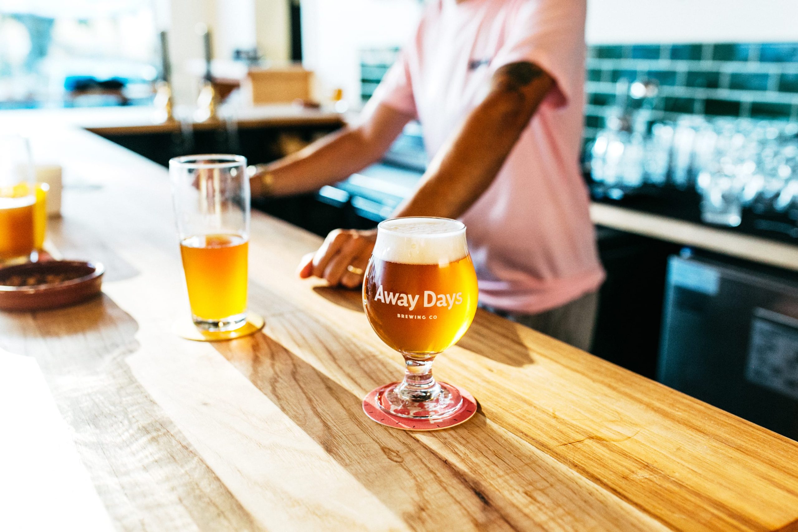
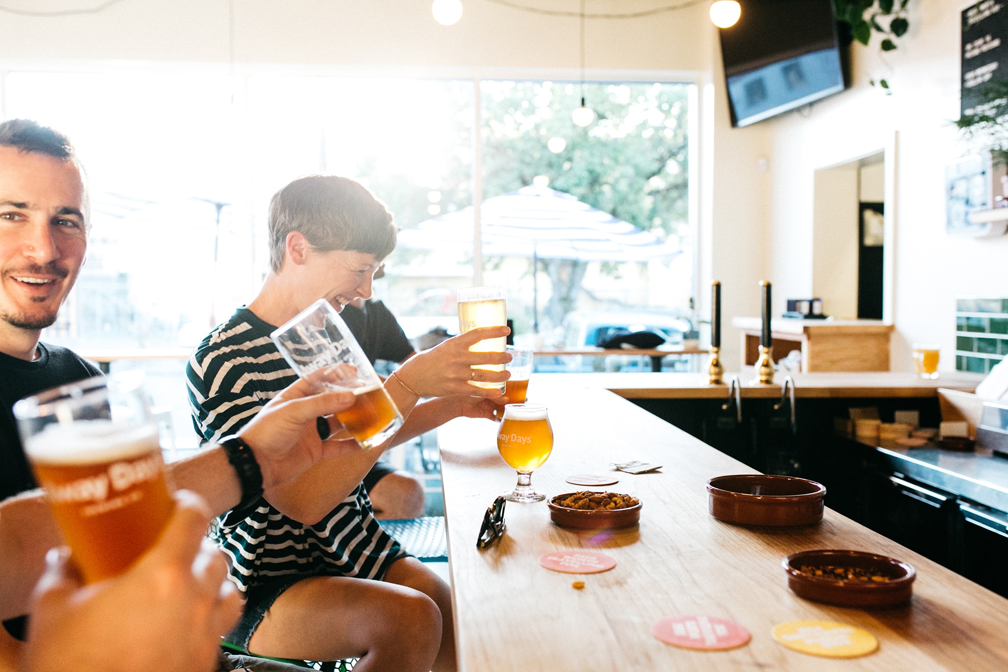
Away Days Brewing Co was born out of Portland-based English football pub, The Toffee Club. Its beer follows in the owners’ footsteps, from humble European roots to honorary Portland mainstays.
The solution to the identity lay in their name, and its double meaning – holidays in the US, and following your (footy) team in the UK. This perfect balance of travel, adventure, passion and dedication kicked the whole thing off.
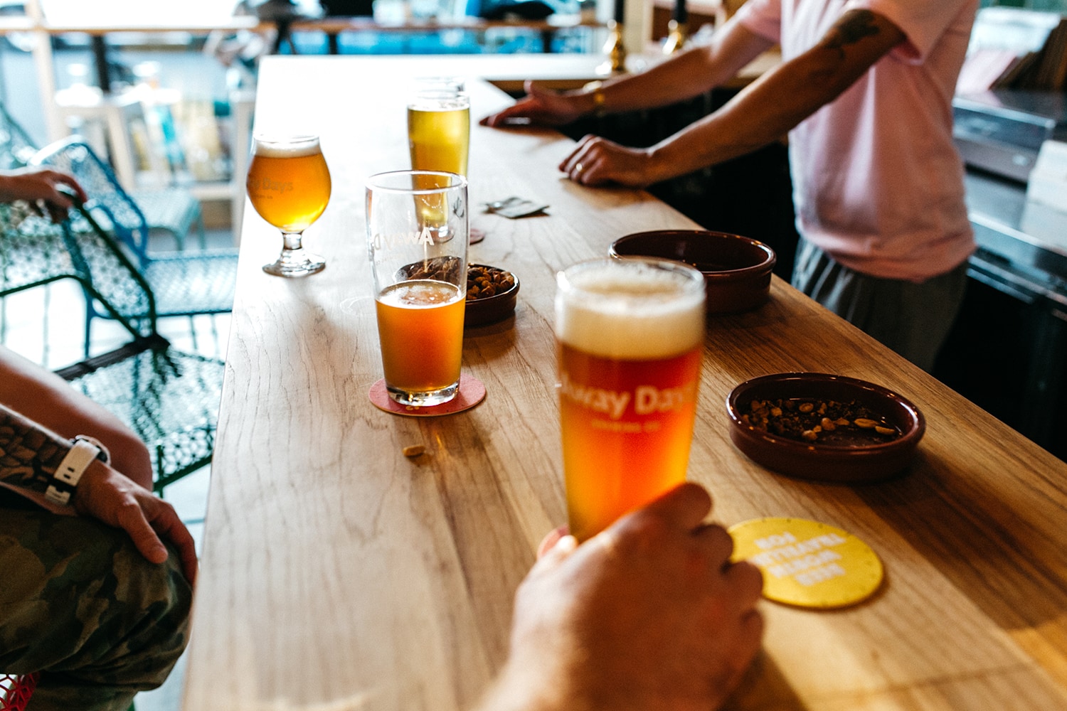
Cheers!
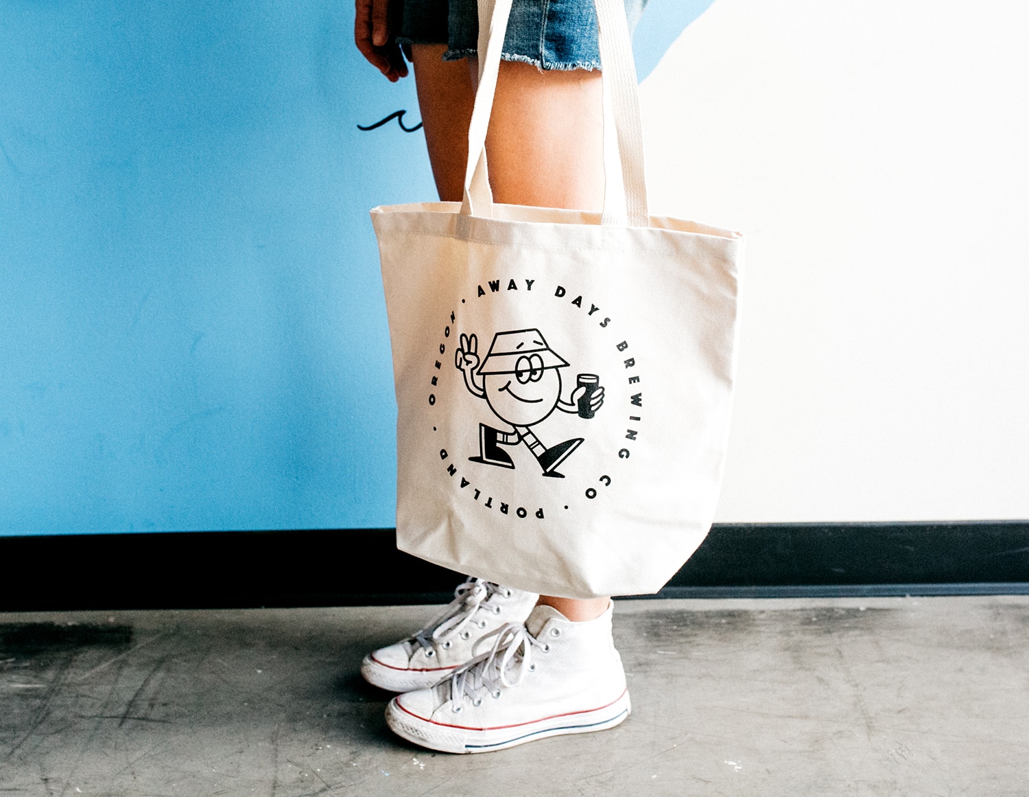
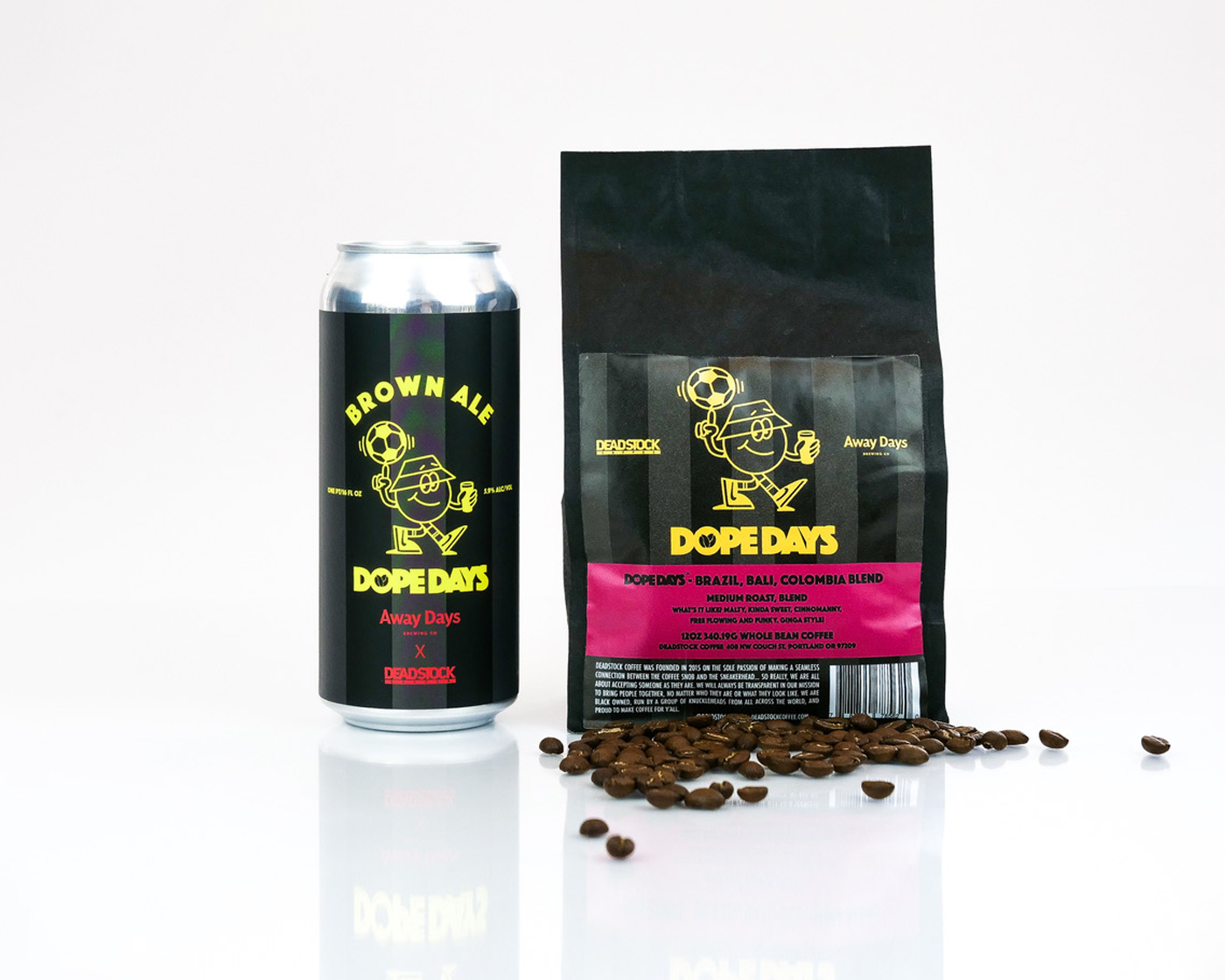
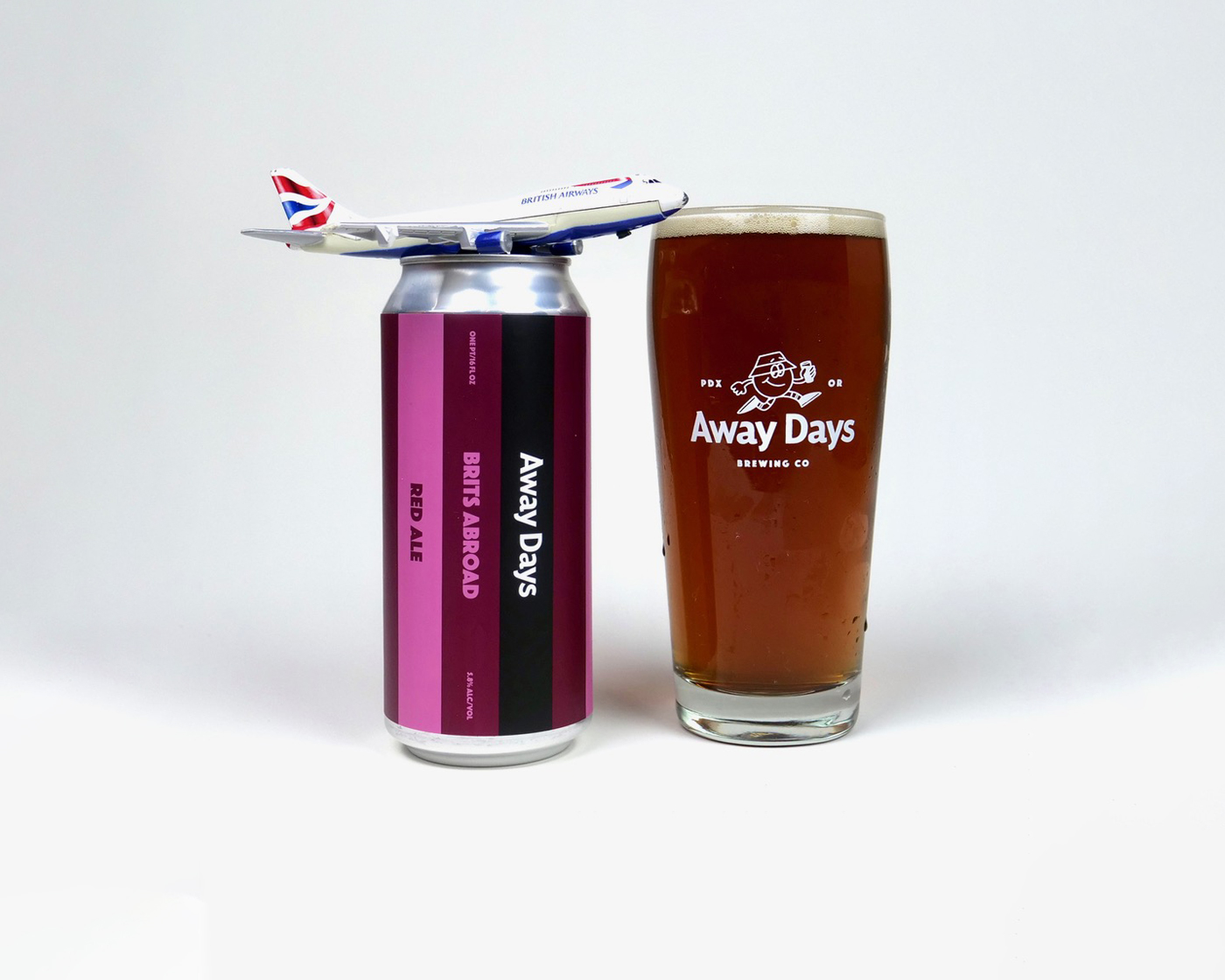
When tasked with appealing to a younger beer-drinking crowd, we turned to street and skate culture for inspiration. With that, our brand mascot Away Dave was born – forever on the move with beer in hand.
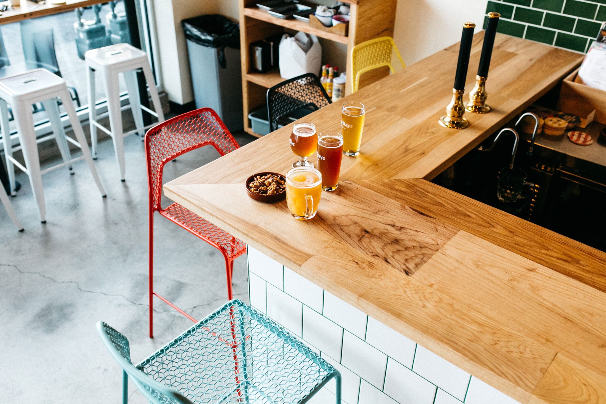
Land of Plenty has given us a really strong foundation from which to build our brand. We’ve already grown the wholesale business to over 25 bars and restaurants throughout Portland, including Providence Park – home to our beloved Portland Timbers
Away Days Founder
Showing our stripes
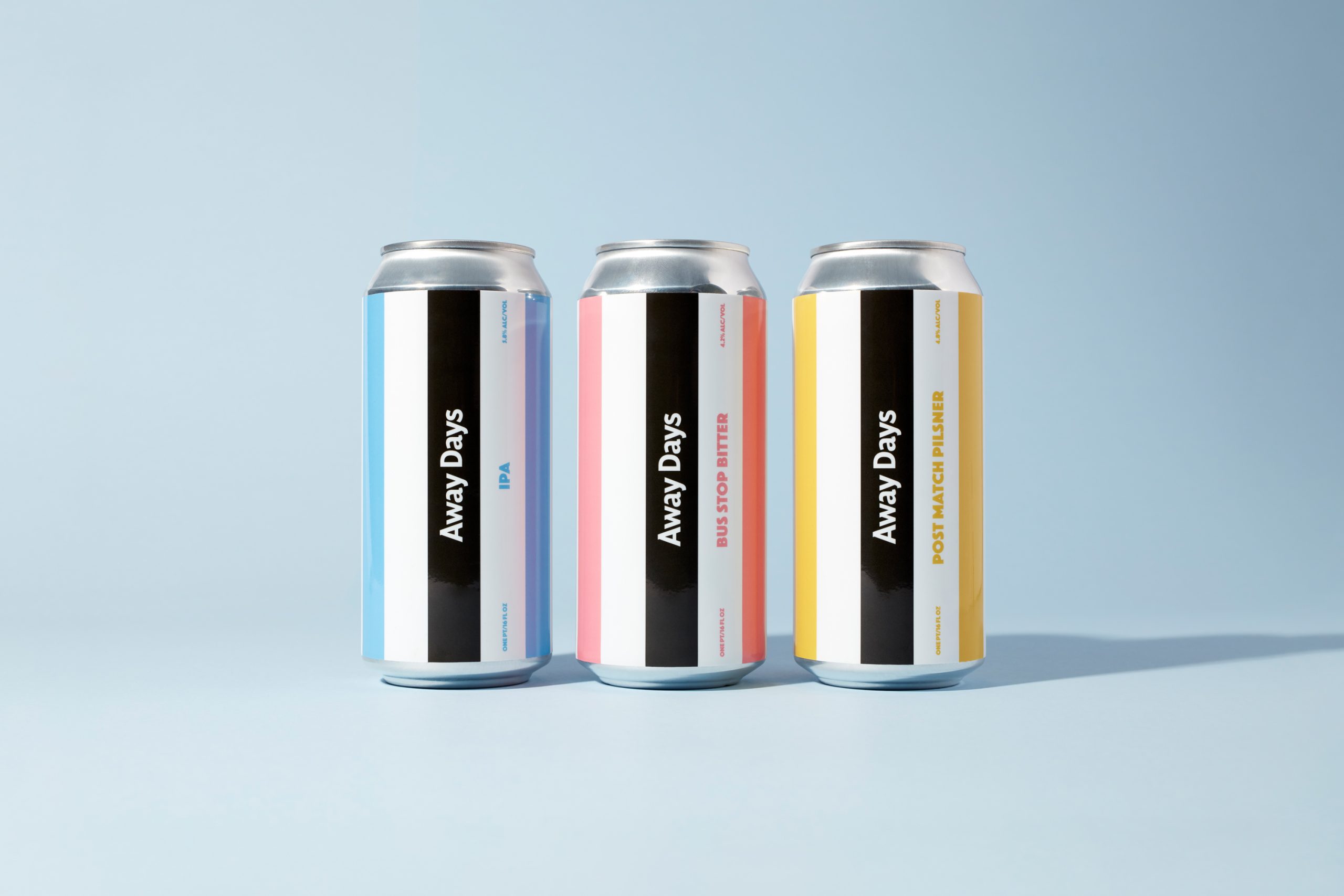
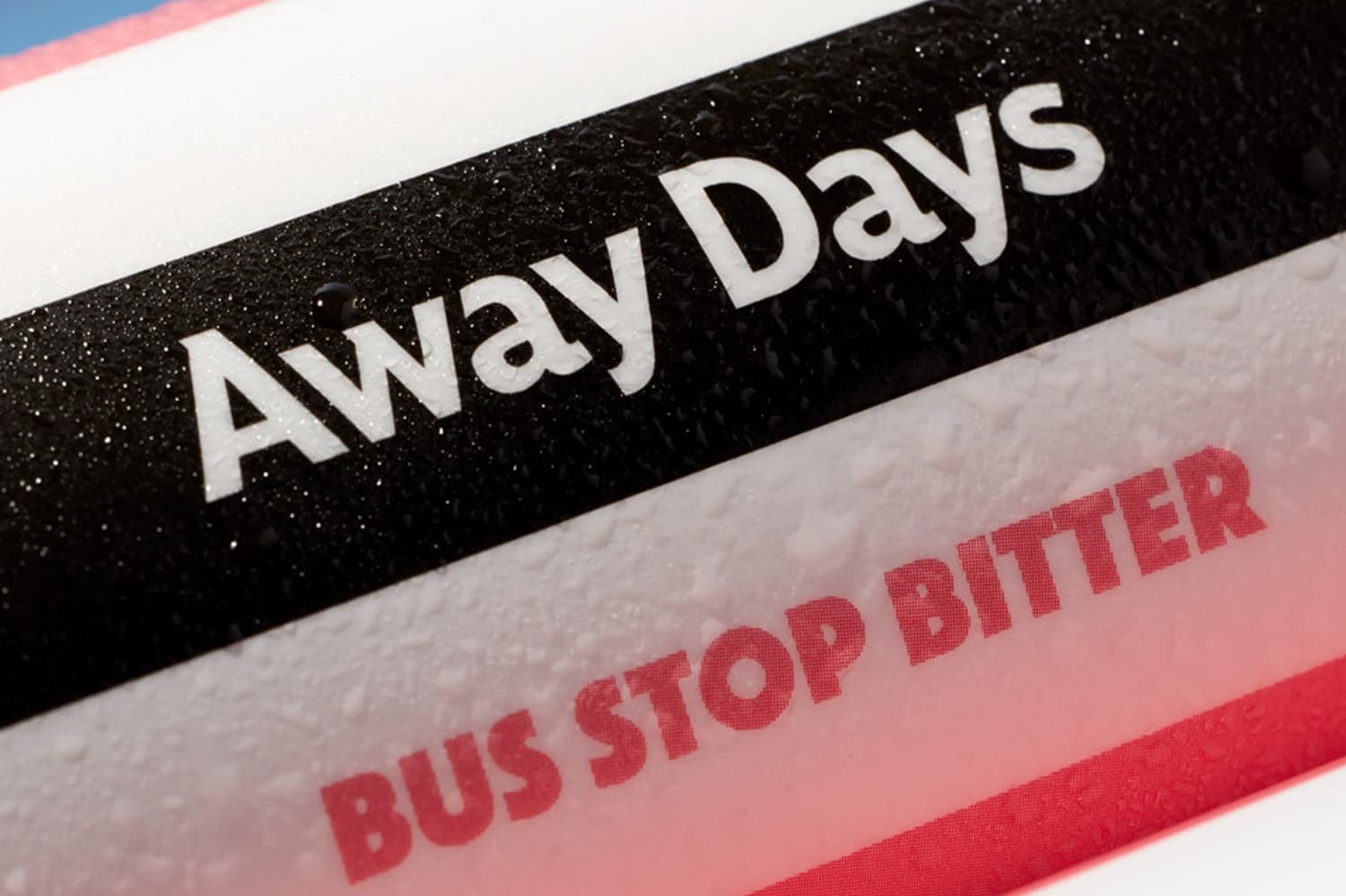
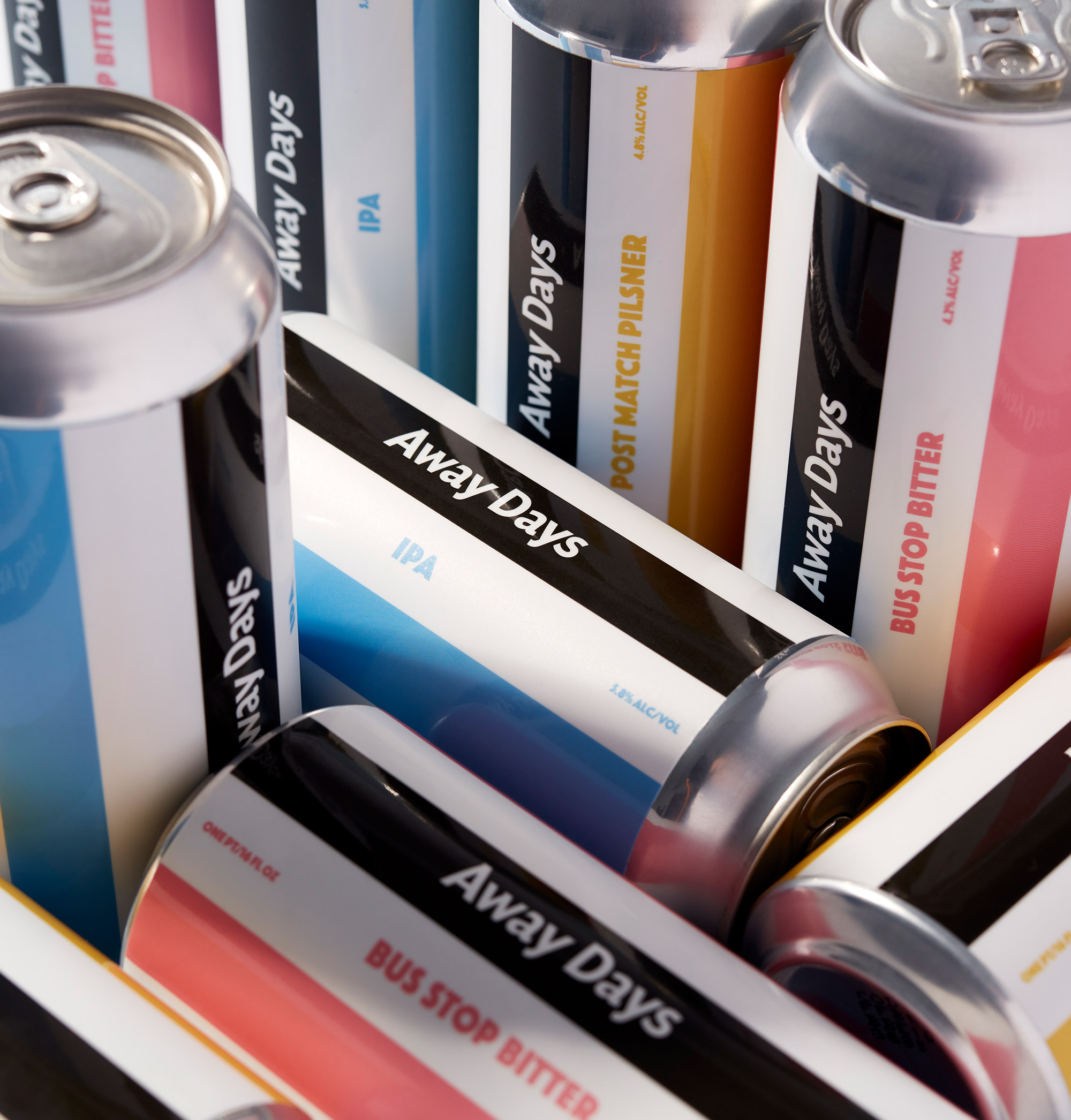
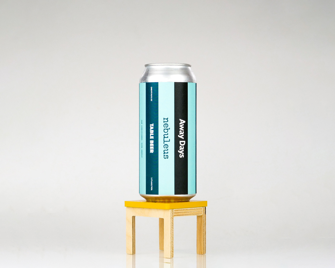
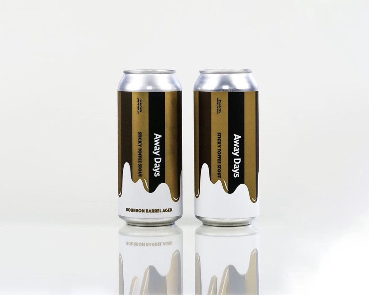
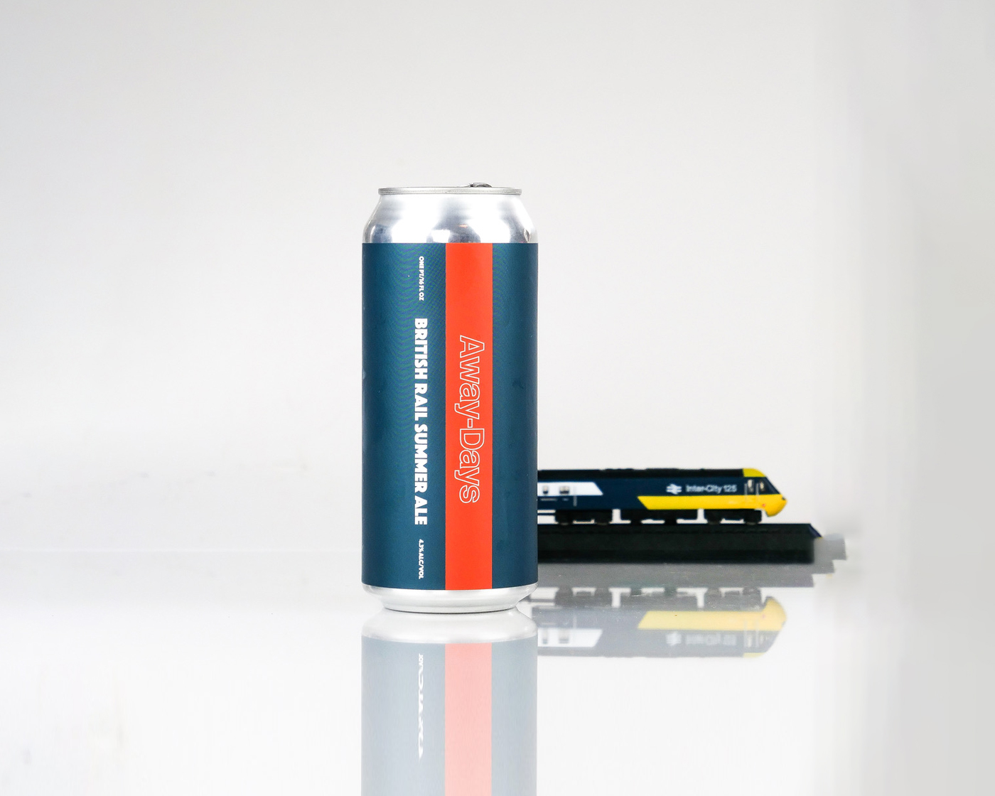
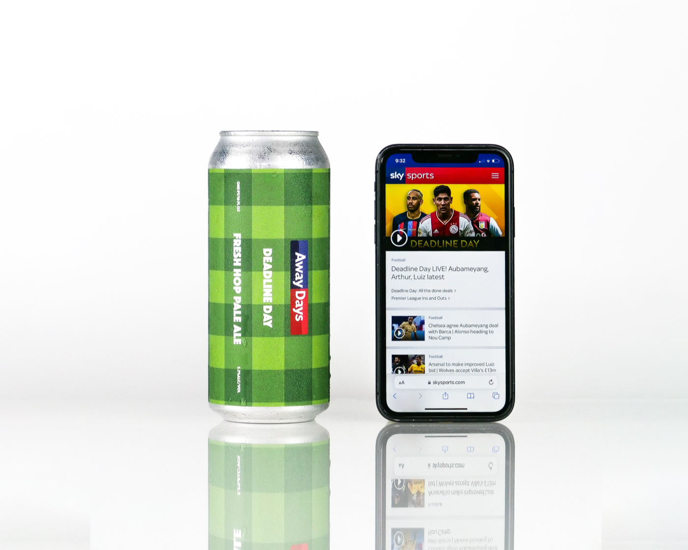
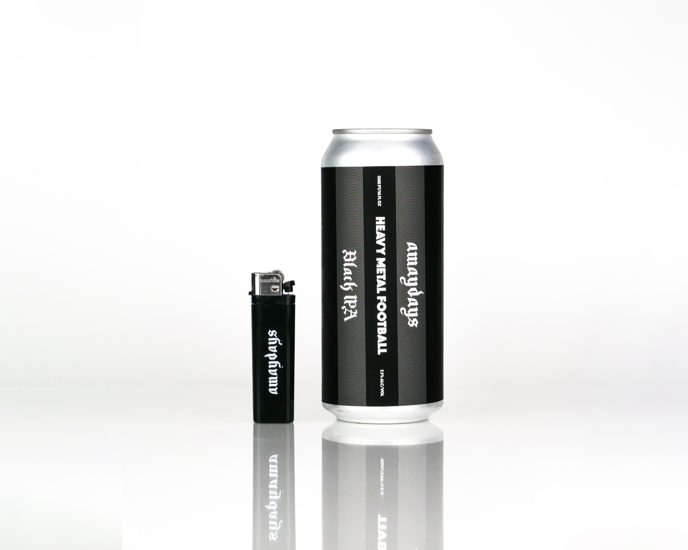
The graphic identity was built around a bold stripe, reminiscent of parasols, deckchairs, and continental bar awnings (plus a subtle nod to classic football jerseys, of course).
This systematic approach allows Away Days to package and distinguish between multiple beers at very little ongoing cost.
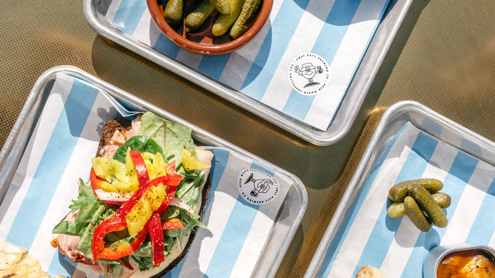
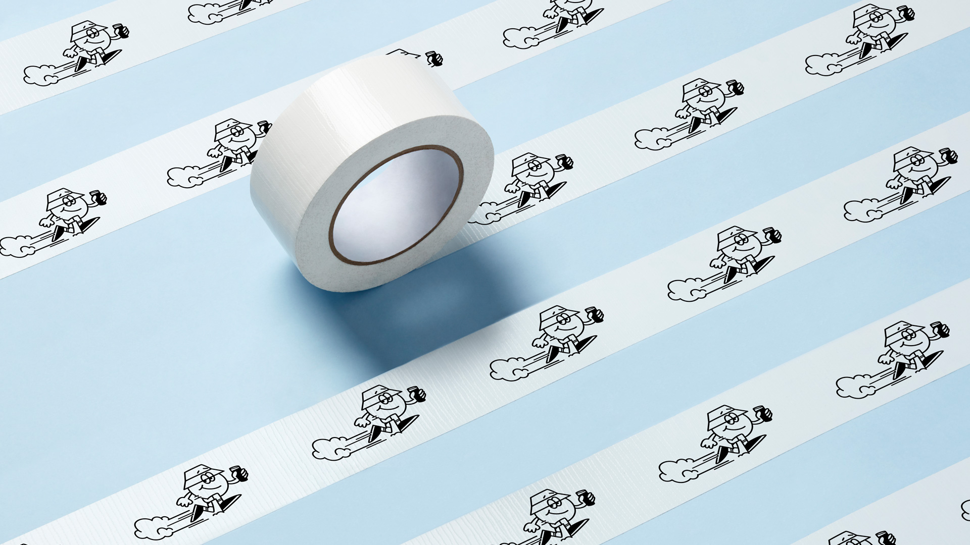
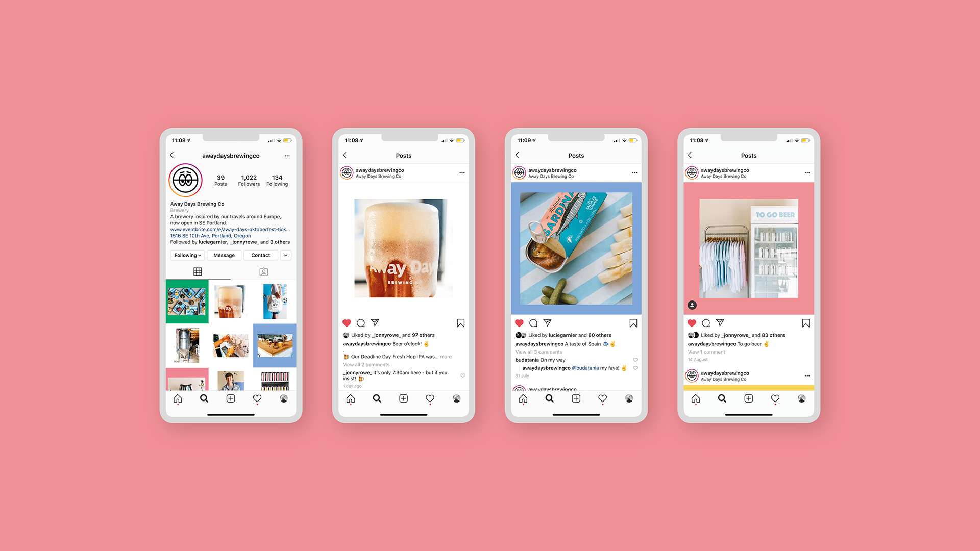
By embracing a more youthful, street-culture-led approach, the identity cuts through the saturated and sometimes predictable Portland craft beer scene. Furthermore, since completing the initial branding piece in 2018, Away Days has gone from strength to strength, flexing the identity system we set in place, through the creation of over 50 new beers – pushing their brand to new heights one beer at a time.
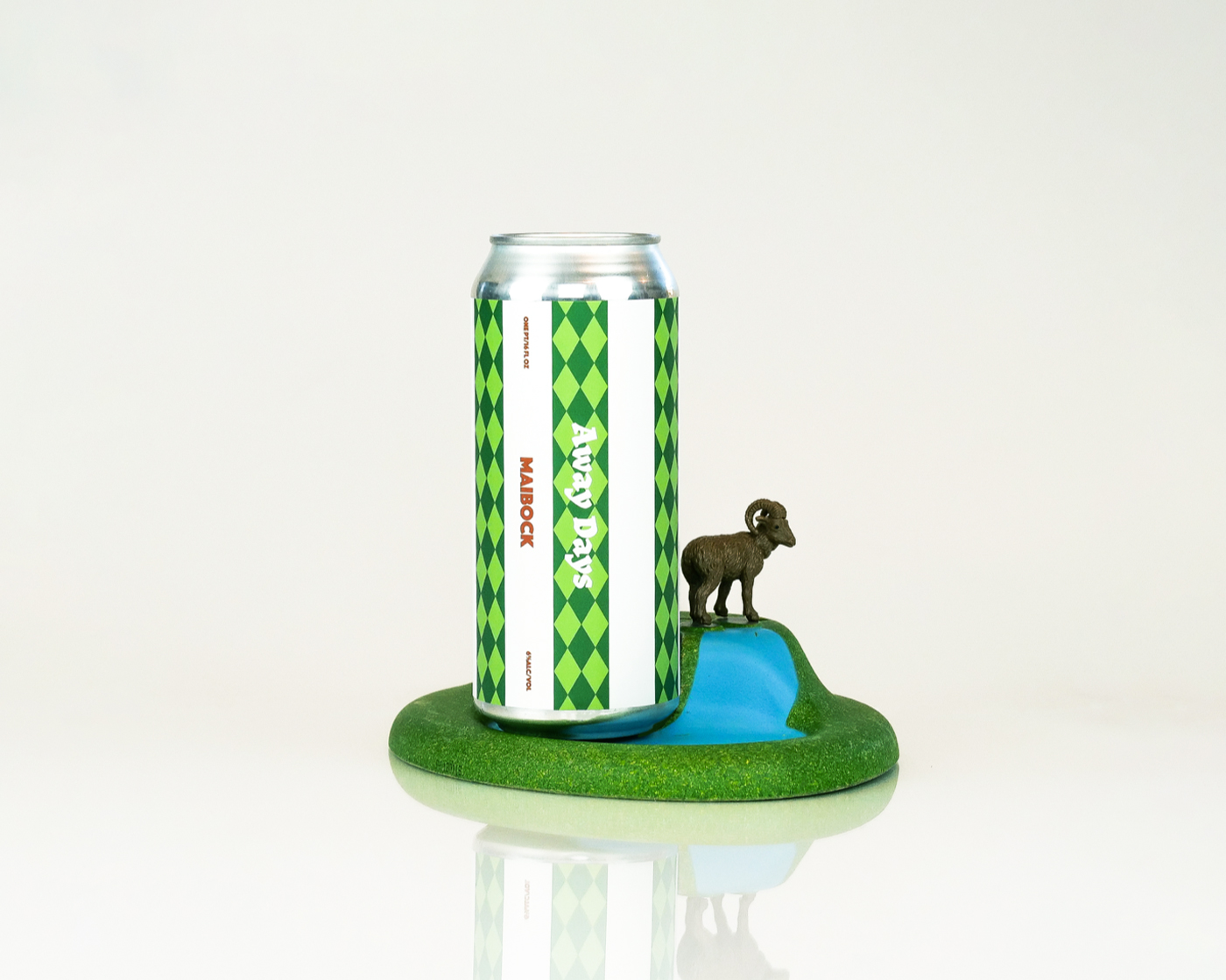
Avery Dennison